Digital Marketing
Communicating in Color
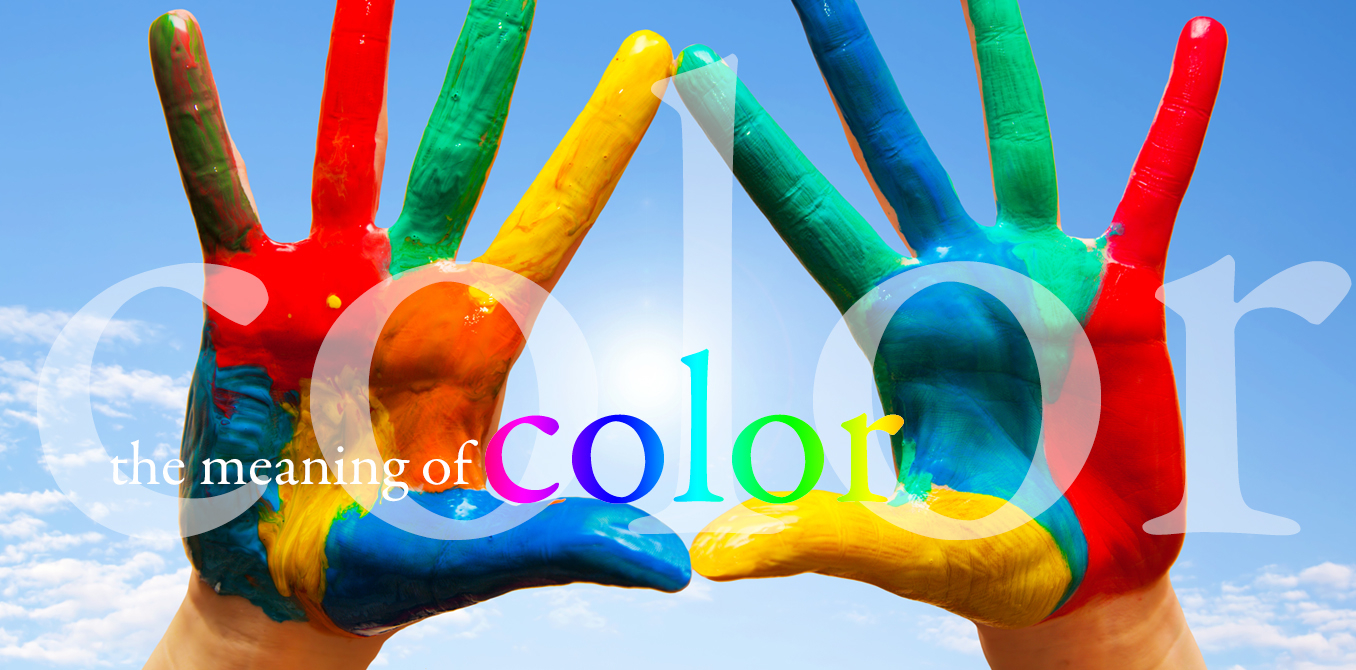
When designing a logo, website or any other marketing collateral it’s important to choose your colors wisely. Just like fonts, layouts and pictures convey meanings, so do colors.
While color can be very subjective there are some more or less global associations in each part of the world. Here are some general assumptions in the United States.
Blue – Security, stability, trust, confidence, science, tech, confidence, left (politics)
Green – Medical, environmental, wealth, calm, healing, natural, technology
Red – Energy, courage, anger, power, strength, right (politics)
Yellow – Spirituality, optimism, freshness, clean
Pink – Feminine, love, non-threatening
Orange – Fun, creative, young
Color meanings in different countries
Choosing the right color for your brand gets trickier though when you are marketing to other countries, as the color meanings can vary from one country to another. Take for example, politics in the United States. When designing materials for a candidate that leans right, you will likely use reds; whereas, you would lean on blues for a candidate on the left. Seems obvious, right? But what if you were designing the same campaign in a European country? You would probably make the assumption that the same rules apply but the opposite is true. Red in Europe = left, blue = right. Confusing, isn’t it? It goes beyond politics though. Red in the Western hemisphere is generally associated with danger; whereas China associates red with prosperity. And while purple signifies luxury in the United States, it is the color of mourning in Thailand.
I use the examples above to illustrate the most important point when choosing colors for your marketing materials, KNOW YOUR AUDIENCE. You must research your audience before choosing colors to ensure that you are communicating in their color language.